MOODBOARD #2: A MATERIAL MOODBOARD.
by Irene Izzo - Design Manager
«On the ball»
How to be “on the ball” and then do a good job? Let’s take it slow.
First of all, as in everything, the choice of materials must start from the study of the concept.
It’s necessary to analyze the idea at the base of the project, the concept you want to give life, the atmosphere you want to recreate, and the experience you want to make their guests live.
Only in this way, it’ll then be possible to identify the best solutions at a functional and aesthetic level.
And believe me, the choice of materials is one of the most important and delicate phases of a project.
Yes, both because the success of the project depends on it (obvious to say?) and both because these choices will affect the maintenance costs that you have to bear.
So? So, you need study, analysis, sampling, a large network of suppliers and the game is done… or almost, because it also requires a lot of knowledge and experience to choose the best solutions or to propose more suitable alternatives of those proposed by the customer.
And that’s what we try to do every day for you 🙂
Let’s go to moodboard. Today, I propose to you the moodboard that we have realized for the hall of Crowne Plaza Geneva.
We said we should start with the concept. It was clear here.
The concept had to be respectful of the materials introduced in previous projects in other areas of the Hotel, which reflected the idea of nature and gardens.
In addition, the colors for the hall had to be warm to recall the idea of elegance but also had to give a touch of warmth and hospitality to this area.
The idea was to create not a large hall but a kind of multifunctional “living room” in which the keywords are sharing and flexibility.
Which study did we do and which materials were chosen to recreate this?
«In this moodboard you find:»

«Shine»
I know, you expected to find the name of the material used. But I wouldn’t be original, and I am. So I’ve chosen, for every material I’m going to talk about, a characteristic of it, which is also given to the area where it’s used.
Which material is bright? The marble. We chose white marble to create, maybe, the central element of the hall, that is the wall which looks like a curtain.
In fact, the idea was to create a wavy wall that, with a play of lights, can give the impression of being a curtain, all to give less rigidity to the environment.
After a series of studies, we have identified that the grey veined white marble is the perfect material to give to the element the desired “chiffon” effect.
The marble was worked and made three-dimensional to create the wall, and today this latter looks like a real curtain.
The marble was also used on the table top to create a link between the spaces.
Moreover, contrary to what was designed, since the marble has not been treated, this element has not been realized at full height, for maintenance and cleaning reasons. The most curious guests would surely touch it 🙂
Which other element is bright? The glass.
With the glass was made the balustrade of the stairs. Why did we choose glass? Simple, to not cover the view from the seats of the hall on the marble element described above.
I’m not even telling you the amount of work we have to do to create this balustrade on an existing scale.
«Functionality»
Well, don’t you want to put the functionality in a respectable moodboard?
Based on the assumption that all the materials we use in the projects are functional, here we have chosen just these two to create a piece of furniture that is both decorative and functional.
The materials in question are glass and fabric.
For this element, a sliding system has been designed with very large doors customized. The customization comes from the fact that the doors were made of glass, with black metal frames, and inside the glass was inserted the fabric to give greater coverage and aesthetics.
The fabric used recalls the wallpaper present in this area; In fact, these two materials have the same texture.
«Continuity»
Of course, I think you agree with me, in any area or space of a Hotel, there must be a certain continuity. It is also true that today, we have already talked about it, for example, making Hotel rooms in different styles has become a real trend, but we added that, even in this case, there must be a common thread to be sought in the choice of the colors and materials used.
So, to have continuity between the different environments of the Crowne Plaza Geneva, in this moodboard we inserted for the floor, the same tile in wood-effect stoneware that we had used in the project of public areas of 2013.
In addition, the dark wood chosen for the furniture and walls of the hall is the same as used in public areas.


«Comfort»
Ah, for comfort I spared no expense, I inserted 4 materials.
What gives you the feeling of comfort? Well, to me, perhaps by professional deformation, think of a fabric and the bristles of a carpet, or rather of a moquette.
Yes, because these four fabrics, blue, turtledove, red and green, were used to make what looks like a carpet but is actually a moquette.
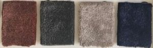
We chose these materials to ensure that this solution is on the same level as the floor, which is not possible if we chose a carpet.
Behind its realization, there was a careful study and analysis to not create the difference in height between the carpet and the floor.
There was also a strong customization to make this element able to be functional from maintenance and cleaning point of view (if the coffee falls, it’s not a problem)(a normal carpet doesn’t have this characteristic) and also able to be comfortable as, instead, a real carpet is.
For this reason, we did not choose standard braided short-pile materials, but we opted for custom materials.
Drawings on drawings have been made to create this unique element of its kind.
«Malleability»
Come on, this time, I don’t even ask the question, another sample of material included in today’s moodboard is copper.
Which other material more than copper is suitable for different uses? Nobody.
In the hall, in fact, several elements were made of copper, such as the self-supporting structure, the chandeliers and the feet of the tables. This material was also used in the breakfast room.
And if it is easy to adapt it to different uses, the same cannot be said about obtaining the same color.
In this regard, also here we opted for a strong customization, making samples on samples to ensure that the colour of the copper used in the hall was the same used in the breakfast room.

«Coverage»
The latest materials of moodboard have the characteristic of coverage.
What am I talking about? Obviously about fabrics.
We have chosen fabrics with warm colors as established by the concept, for the seats in this area.
The fabrics in question are in simil velvet and they respect the standard and the rules provided for the Hotels. They are also wear-resistant, stain-resistant and flame-retardant.
For each seating, after several studies, we have matched these fabrics with the legs to give to the space a more aesthetic touch.